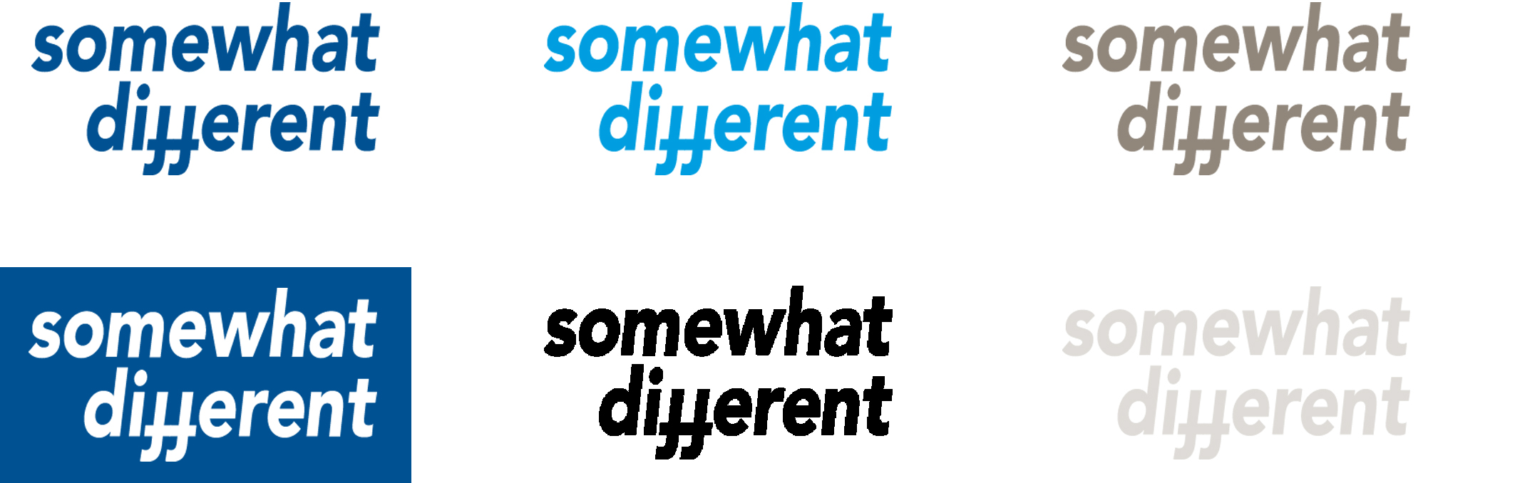
Hannover Re calls itself "The somewhat different reinsurer." This "somewhat different" claim is printed in the Avenir Black Oblique font. The claim is an invariable word-based brand and may not be imitated or changed.
The claim may only be used in conjunction with the logo. It is not used as a stand-alone element.
Ratio of logo to claim
The ratio between the two elements must not be changed. It is calculated as follows: The height of the "n" in "hannover" represents 100%. The height of the "m" in "somewhat" is 75%.
Colours
The claim should always stand out well against the background. To achieve this, four colours are allowed for the claim: HR blue, HR cyan, HR warm grey and white. Logo and claim may be different colours.
Positioning
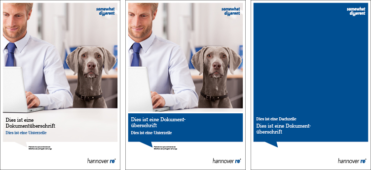
Claim and logo are optically separated to emphasize their individuality. If the logo is in the preferred position (bottom right), the claim is at the top right against the edge of the image.
In media with the logo in a non-standard position, the claim must be located as documented in the corresponding section.
Image backgrounds
The word-based brands may be set against a background image. However, this should not impair the legibility of the brand. The word-based brands may be used in positive or negative style, depending on the shading (light/dark) of the image.
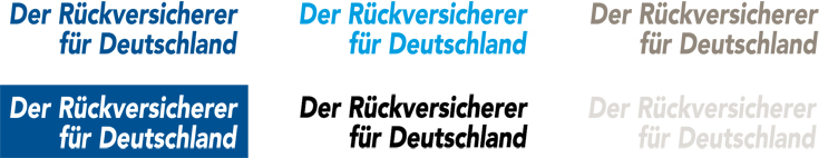
"The reinsurer for Germany" claim
E+S Rück calls itself "The reinsurer for Germany." The claim is set in the Avenir Black Oblique font. This element, too, must not be imitated or changed.
Ratio of logo to claim
The ratio between the two elements must not be changed. It is calculated as follows: The height of the "ü" in "Rück" represents 100%. The height of the small "r" in "reinsurer" is 55%.