We use the term "brochures" to refer to bound or stapled printed materials that the reader can leaf through. The standard format for brochures is DIN A4. For visual orientation, brochures are integrated into the publications and brochures system.
Title page design
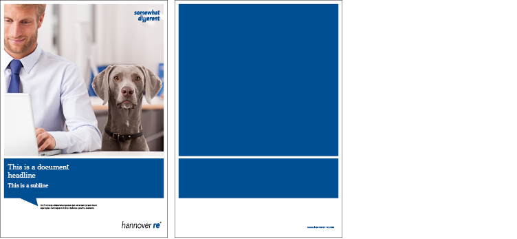
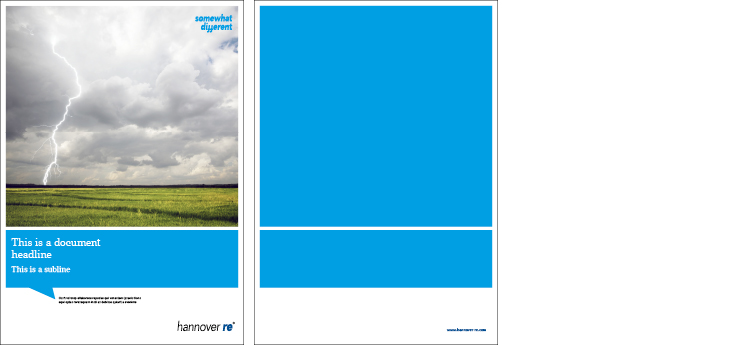
Image and speech bubble: This layout is used for image communication. This category includes all kinds of image brochures and folders published by the Group and its subsidiaries.
Layout: On image brochure, the speech bubble appears as a coloured area under a rectangular picture. The height of the picture is 4/6 of the page layout matrix, the height of the speech bubble is 1/6.
Colours for the speech bubble: HR blue, HR cyan and HR warm grey (full colour and 30% gradations). The colour of the coloured area should be chosen to contrast with that of the title picture, so that the overall impression is neither too plain nor too gaudy. The coloured area on the back page must be the same colour as the title page.
Example Image brochure group
Example Image brochure acquisition
Inside page design
The elements listed below have been defined for use in designing image brochures. They provide enough versatility to back up the content and purpose of the various publications while lending them a distinctive form.
The inside pages are made up of the following elements:
Type area and line spacing grid
The type area is based on a 12-column matrix with a spacing of 4.5 mm and so offers lots of possibilities for versatile layout. Within this type area, the text is always 2-column, except for forewords or editorials, which are single-column. 2/12 columns are left empty to the gutter. Pictures may be outside of the type area, but must be positioned within the 5 mm frame. To emphasize the 5 mm frame on the inside pages, too, at least one picture on a double page must be positioned against this border. Other images may be placed anywhere within the 12-column type area. Pictures should preferably not all be positioned entirely within the type area.
The standard line spacing within the grid is 12.5 pt. The fill of the text frame and the vertical positioning depend on the amount of text and the space taken up by pictures. On introductory picture pages, the white space above the text can be used to create optical tension. The minimum height of the first line of text must not be less than 3/6 of the page. The spacing between the hierarchy 0 heading, the leader text and the start of the continuous text must likewise be observed.
Frame
A distinctive element of the Corporate Design is the white frame, derived from the title-page design, around pictures and coloured areas, which is also used on the inside pages. Relative to size DIN A4, this frame measures 5 mm.
Page numbering and versioning
The page number is shown on each page flush against the outside border of the type area. The page number is never superimposed on a picture. If it would be, there is no page number on that page.
By versioning we mean displaying the Hannover Re brand name and the title of the publication. The version name is shown on each page flush against the inside border of the type area. It is never superimposed on a picture. If it would be, there are no version data on that page.
Font hierarchies
Brochures follow a defined font hierarchy which must always be strictly observed. The applies both to title pages and inside pages. In the descriptions below and in all dedicated PDFs and InDesign templates, the heading hierarchies are designated HL0 to HL6.
A leader text may be used only in combination with the HL0. Here the spacing described above under "Type area and line spacing grid" must be observed.
HL1 is used only if a publication has at least two lower hierarchies. Otherwise it is skipped, and the publication starts with HL2.
Continuous text is always set in justified style. The only exceptions are forewords and editorials, which are set in ragged type.
Pictures and captions
Narrative pictures are used in brochures. A precise description is given in the Imagery section. Narrative picture are always accompanied by a caption. The picture and caption form a single unit in the design. The caption always stands next to the picture and is aligned flush with the image. The distance between picture and caption is always a 4.5 mm space within the 12-column grid. As a unit, image and caption are always flush with the 5 mm border and the text frame.
Pictures and captions may be placed only within the 5 mm frame and the 12-column grid. Pictures must not extend into the trim area and must be aligned with the grid and/or the 5 mm border on one page. On a double page, at least one picture must be positioned against the 5 mm border. Any other pictures may be placed anywhere within the 12-column grid. Pictures should preferably not be placed entirely within the type area. The minimum width of a picture in portrait format is 4/12 columns of the grid matrix, and the height is at least 75 mm. A caption is always 2/12 columns wide and varies in height depending on the amount of text. If there are several pictures immediately next to each other, the captions may be brought together in a text frame. In this case the order of the pictures must be identified, e.g. with "from left to right."
Full-page images are allowed and must be positioned against the 5 mm border. Heading, leader text and caption are then superimposed on the picture. Attention must be paid to ensuring that the text is easily legible and is positioned on an unbroken area of the image. Here, too, the text elements must be aligned to the grid. The spacing of the font hierarchies as described in the Type area and line spacing grid section must be observed. If there is a caption next to the picture, only HR cyan may be used. If the caption is superimposed on a picture, it may be in HR cyan, black or white.
Quotes
By quotes in brochures we mean not only reported speech but also specially highlighted text passages. A quote element is always as wide as a text frame, is introduced by a speech bubble line, and stands within the continuous text. It is separated from the text by two lines of the line spacing grids above and below. Only HR cyan may be used for the speech bubble; the same applies to the lettering.
Caborio. At fugitiat. Cilique solupti dolu amusdan daernatur? Quis sant a quim ulparchicius raecte nobit ressuntem fuga. Git quidesito. Aborem. Itatesque esed uf fugit officiis ullabo. Temodisci ventos ias eatur? Lecest mo que ea eum quid ur arument. Cae nobis eica dia sitiamou.
Information boxes
Information boxes contain additional information on the text. An information box is always as wide as a text frame and is framed within two lines in HR cyan. Quote lines and information box lines always have the same thickness.
Ao cumprimentar o pai, diz
How, ao que o pai replica: "How I know. I want to know who", falar bem de mim mesmo (que cara legal!); enfim, ninguém vai Pediram-me que escrevesse um Blindtext Em portugues seria algo como o texto para cegos ou texto cego. No Brasil também chamado de Nononono (eu sempre me pergunto se tanta energia negativa nao acaba influenciando o cliente). É aquele que vai nos layouts simulando o texto final.
Tables and charts
The design guidelines for tables and charts are given under the section Tables.
Tables always extend over the full width of the 12-column grid, whereas charts usually take up the width of one text frame. If this is not enough, the chart must be extended over the full width. Charts are positioned within the continuous text with one empty line of the line spacing grid below.