General
Always use the full width of the slide within the guide lines for charts. Try to give the bars, columns, rings and lines you use in your presentation a uniform format and follow the formatting instructions in this section.
You can also find model slides in the folders under “Element” in the add-in “Efficient Elements”.
Colour hierarchy
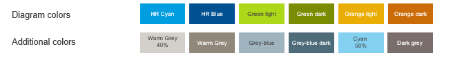
Stick to the colour sequence when creating charts to ensure consistent use of colours in all company presentations. The sequence applies to all types of charts except line and waterfall diagrams and those with only two data series. Here are the permitted colours again:
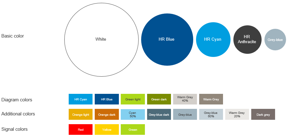
Colours for use in charts
Fonts
- Legend: Arial, font size: 11 pt, colour HR anthracite
- Data values Arial, font size 11 pt, colour HR anthracite
- X axis: Arial, font size: 11 pt, colour HR anthracite
- Y axis: Arial, font size: 11 pt, colour HR anthracite
Please do not use the chart title formats automatically offered by PowerPoint but only the title boxes pre-defined in the model slides in the Element Wizard.
Fonts for use in charts
Lines
- X axis/zero line: 75 pt wide, zero line colour HR anthracite, no scale marks
- Y axis: no line
- Grid lines: 75 pt wide, grid line colour HR grey blue 60%
Horizontal grid lines are always used except for line diagrams and ring charts.
Lines used in charts
Legend
The legend is always placed beneath the chart left-aligned to the X axis – legend position (1).
In stacked bar and line charts with several categories, the legend may be positioned to the left or right of the chart, parallel to the X-axis – legend position. (2).
Legend positions (1) and (2)
Types of chart
Ready-formatted model slides for all types of charts described here can be found in the add-in section “Element” – “Charts” – “Samples”. You can insert these slides simply by clicking on an example and using the “Insert” button on the bottom. Now you can fill the database in the background with your data.
Sample slides for various charts
Column and bar charts
When formatting column and bar charts, please follow the guidelines given above.
Columns/bars:
- Solid fill: as per colour hierarchy
- Border colour: solid line 1.5 pt in HR white
Data may be entered as totals above the column or to the right of the bar. (1)
If grid lines run directly through a value, the data field is formatted with a white background. (2)
Chart showing totals
If there are more than one sub-values, these are shown inside the column or bar (3).
Chart showing sub-values
If a bar chart is combined with a line chart, the line appears in colour HR blue.
Combined bar and line chart
If a chart shows only two data series, the columns/bars are shaded in HR cyan and HR warm grey 40% as an exception from the colour hierarchy.
Charts showing only two data series
Charts showing only two data series
Similarly, HR warm grey 40% and HR cyan are used for emphasis, the column/bar to be emphasized being shaded in cyan.
Emphasis in bar and line charts
Waterfall diagrams likewise follow this logic, positive data and initial and final values being shown in HR cyan and negative values in HR warm grey 40%.
Model slide for waterfall chart
The trend arrows for visualising changes and trends are stored in the add-in section “Element” – “Charts” – “Diagram options” of Efficient Element.
Trend arrows
Trend arrows
Doughnut charts
Doughnut charts are a convenient way of illustrating percentage distributions.
- Doughnut segments: solid fill - as per colour hierarchy
- Border colour: solid line 1.5 pt in HR white
- Angle of first slice: no rotation
- Doughnut explosion: together (0%)
- Doughnut hole size: 75%
Data values are shown outside of the slices and must be entered manually.
Models for various ring chart options are stored in the add-in section “Element” – “Charts”.
Sample slides: doughnut charts
Sample slides: doughnut charts
Line charts
In the interest of greater clarity, grid lines can be omitted in line charts.
Furthermore, a special colour sequence is used for improved visualisation:
Colour hierarchy in line charts
- Lines:5 pt wide
- Line colour: as per the colour hierarchy for line charts
Please also note the permitted marker types and their prescribed sequence.

Marker types/distinguishing symbols for line charts
You can select and format these under “Marker Options”:
- Marker: Size: 7
- Marker fill: solid fill as per the colour hierarchy for line charts
- Marker line: solid line 1 pt in HR white
Sample slide for line chart