This documentation deals with the definition, generation and use of icons/pictograms.
It is structured as follows:
Definition of an icon/pictogram
Visual communication essentially uses three components to convey information:
- text information (including tables)
- photographic images
- graphic and illustrative elements such as figures, charts and icons/pictograms
Icons/pictograms are graphic symbols that present an item of information in the form of stylized images or drawings. Unlike writing and photographic images, they are universal in character and, provided that they comprise and consistently follow a generally accepted system of symbols, they permit unequivocal interpretation of the message communicated. As a rule they are informative by nature and are not used for decoration. Thanks to their simplicity, they are mentally absorbed faster than text or photos and catch the observer's eye.
The essential properties of icons/pictograms are:
- uniquely defined symbols that are always used in the same way
- reduced and symbolic representation
- internationally understood and independent of cultural background
- ideally, clear without explanatory text
The essential functions of icons/pictograms are:
- to convey information at a glance
- to represent instructions in a graphic image
- to provide guidance within complex situations
- to weight facts
- to structure the presentation of information in text
Possible ways of conveying information through icons/pictograms:
- the meaning is clear from the symbol alone (e.g. standardized emergency exit signs);
- the symbol is explained by an accompanying text;
- the symbol explains itself by being consistently used over a prolonged period so that the user immediately associates the picture with the intended meaning.
Distinction from other elements of communication
Text
Texts provide the greatest depth of information but take longest to absorb and require the most attention for processing. In digital media such as Powerpoint or in the Internet, especially, long texts detract from reader-friendliness. In these contexts, pictographic symbols can help to simplify, optically enhance and break the text down into more manageable units. The CD Online Manual deals with designing and structuring texts in Image brochures.
Photographic images
Images reinforce a content aspect of the text or visualise a special message. Unlike e.g. texts, they take effect immediately and depend on the observer's taste and cultural background; however, this different effect is not always intended. By contrast, icons/pictograms are better suited to conveying information in a way that is universally understood and neutral. Use of images is dealt with under Images.
Infographics
Infographics (figures and charts) are ideal for visually presenting facts (e.g. numerical sequences, trends or comparisons). Their form depends on the purpose of the communication and is less strictly defined. By contrast, icons/pictograms are unchanging, self-contained elements representing a content that is precisely defined so that it needs no explanatory text.
Icons/pictograms in communication at Hannover Re
The visual depiction of icons/pictograms is part of the Corporate Identity of the Hannover Re Group and is in line with our goal of understandable, no-frills corporate communication. To achieve the aim of unambiguity, it is essential for icons/pictograms to be used with discipline and in exactly the same way across all media. For this reason, a standard set of pictographic symbols has been developed for corporate communication that defines specific symbols for various specific purposes.
They are an important and helpful component of communication especially in media where fast pick-up counts, e.g. Powerpoint, and in media that need to get the message over across different cultures and across language barriers.
Icons/pictograms are meant to be used as follows:
- if there is a suitable pictogram in the standard set, it must be consistently used for the defined topic – this applies equally/universally to all media (print and digital) and also within a medium when used in infographics.
- if a new, dedicated symbol is needed, this should be created professionally by an agency or qualified service provider in consultation with Corporate Communications. The specifications/dimensioning details below have been defined to facilitate this.
- Photoshop templates incorporating the permissible colours, formats and line guides are available from Corporate Communications upon request – they make it easier to create new items.
Staff should not attempt to create new symbols themselves, as they do not usually have the skills and programs required to produce a professional result.
Use in various media:
Icons/pictograms should preferably be used where quick understanding is important or an eye-catcher is needed:
- Powerpoint presentations
- Internet/Intranet pages
- web applications
Icons/pictograms should only exceptionally be used in large or complex print products . These products should always focus on texts, images, and the other elements of the Corporate Design (infoboxes, etc.).
Rules for use
Minimum size
The smallest possible size is 5 mm in diameter for stand-alones. The minimum size for tiles is 9 mm. Tiles also include squares with a transparent background. Smaller symbols can no longer be adequately recognised.
Figure: Minimum size
Use in connection with infographics
Icons/pictograms (of stand-alone type) may be combined with text and other elements to make infographics/charts and diagrams.
No-goes:
- other stylized elements such as Clipart cartoons or symbols downloaded from the Internet must not be used.
- using two or more icons/pictograms to create an icon with a new, combined meaning is not envisaged.
Figure: No-goes
- excessive use dilutes the rapid information effect. Like all visual elements, icons/pictograms should be used sparingly.
- icons/pictograms are not used for decoration only. They always serve a communication purpose.
Depiction/design
Icons/pictograms are designed to be effective in various sizes and resolutions. The style defined for the standard set applies as the guideline for all new additions and designs.
There are 4 possible depiction versions:
a) Stand-alone symbols (standard depiction)
In this version the symbols are free-standing. They should preferably be used on a plain (single-colour or white/negative) background and are not usually placed on pictures.
Figure: Stand-alone symbols (standard depiction)
b) Tiles
Tiles show the symbol on a square background. These are intended for use as buttons in digital media such as Powerpoint, the Intranet or web applications.
Figure: Tiles
Note: to ensure unambiguous usability, the function of the tile/button should always be identified by an explanatory text: either in the form of a mouse-over or a caption (see point d)
c) Colouring of icons/pictograms
Icons/pictograms in the stand-alone version are always single-colour and when on a tile always two-colour. They may be used in HR blue and HR cyan. It is important to ensure that the icons/pictograms always stand out clearly from the background and are easy to recognise.
Negative versions (stand-alone white symbols or coloured symbols on white areas) are permitted for certain applications. These special cases will be individually adapted via the agency.
Figure: Colouring of icons/pictograms
d) Lettering of icons/pictograms
The symbols are designed to be self-explanatory or so that the meaning is clear from the context – lettering should normally not be needed. Rules for lettering:
- text is always the same colour as the pictogram.
- text is always set in "Compatil Fact." In MS Office programs or digital media the standard fonts may be used.
- text may be placed above or below the symbol.
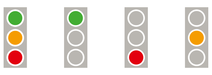
e) Special forms
Special forms are individually developed to meet specific specialty requirements.
Example – traffic lights: these are used only and exclusively for status displays. The signal colours may be used only in this specific connection.
Figure: Traffic lights
f) No-goes
The icons/pictograms may be used only in the versions provided:
- they must not be changed, used in other colours or distorted
- they may be used only in the defined primary and secondary colours. Colour gradients or several colours within the symbols are not allowed.
- they may not be used with reduced transparency (translucent).
Figure: No-goes
The following other icons/pictograms and graphic elements may no longer be used:
- multi-coloured illustrations such as Cliparts or stand-alone photos
- ironic or artistic depictions
- complex graphic representations
- low-quality graphics (poor resolution, colouring, etc.)
- three-dimensional impressions and rendered illustrations
Topic areas/categories
The standard set of icons/pictograms comprises the following categories:
Universal, non-topical icons/pictograms
For example navigation icons/pictograms. These can be universally used in all applications and media and are not associated with special topics.
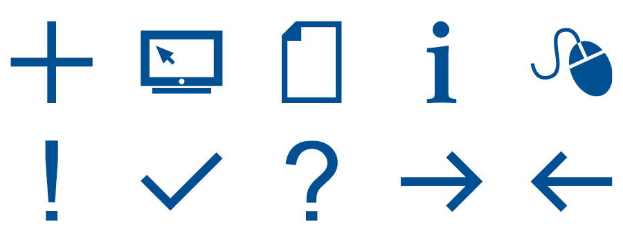
Figure: Navigation - icons/pictograms
Universal, topic-focused icons/pictograms
These are divided into a number of categories for easier orientation , e.g. symbols for the various business segments. They can be universally used in all applications and media.
Figure: Symbols for the various business segments
Specialist topics
Icons/pictograms used within specific business segments, e.g. icons/pictograms for medical topics.
Figure: Specific business segments
Composition and dimensioning
If new icons/pictograms need to be created in addition to the standard set, the following specifications apply:
- icons/pictograms are constructed as vector files
- the symbols should as far as possible be composed from simple basic shapes; if possible, rounded corners should not be used
- if possible, icons/pictograms should be generated from the glyphs of Arial (Regular).
- multiple symbols must not be assembled to form a pictogram
- based on a 40x40mm workspace in Illustrator, the following line thicknesses are used: 3, 5, 8 and 12 pt. (except for "free" organic shapes)
- recurring elements as part of another pictogram are scaled down (e.g. persons in the Meeting icon)
Figure: Composition and dimensioning
Figure: Recurring elements as part of another pictogram
- the space between the pictograms and the edge of the circle/square is 20 % of the background area
- the pictogram stands in the middle of this area; exception: asymmetrical shapes are placed in the optical middle
Figure: Composition and dimensioning
New creations must be sent to CC for approval. This also ensures that the new pictogram will also be available for use by all Hannover Re staff!