Within the Group, a variety of graphs, charts and diagrams are used to visualise facts and data. Optimum readability and the greatest possible consistency are top priority, whichever approach is used. This applies to:
- graphic charts (pie, bar, column charts)
- diagrams, flow charts, organisation charts, etc.
The aim is to achieve a uniform appearance across all media – to the extent permitted by the various programs used. This applies to:
- high-quality printed materials (charts and tables created in InDesign or Illustrator)
- MS Office documents (Word, PowerPoint, Excel)
- Internet
The specifications for MS Office documents are described under the dedicated headings in the Manual.
Specifications for graphic charts
Design
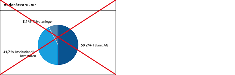
To give pie and bar charts equal balance, pie charts are always shown as rings – never as filled circles. The width of the bars/columns and the thickness of the rings in pie charts is 4 mm.
Separation of coloured areas/segments
For easier recognition, segments within charts are always separated by white lines, width 0.7 pt.
Colours
A set colour scale has been defined for use of the Group colours within charts. The order may be adapted depending on the content (e.g. HR blue stands for the Group as a whole).
The colour attributes are described in the section Colours.
The following colour scale applies to all graphic charts:
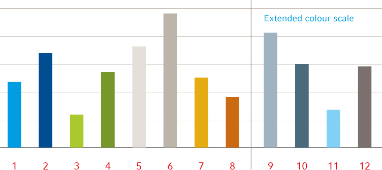
- If only one segment colour is needed, cyan should preferably be used.
- If two colours are needed to make a distinction (e.g. between current/past years), HR cyan and warm grey 60% should be chosen.
If the number of defined colours is not enough, the extended colours may be used in different shade gradations (ideally 60% and 30%).
Self-made documents: Background colours have been defined for use in Powerpoint presentations and Internet displays which are not intended for use in printed media. As far as possible, use of background colours should be avoided in self-made documents, too. Powerpoint charts that are already available may be re-used. New charts drawn in Powerpoint must use only the theme colours, but not the custom colours.
Lines
To ensure a uniform appearance in all media, lines are never dotted or dashed – these are unsuitable for display in online media. The base line of bar and line charts is always emphasized compared to the scale lines.
Only black and warm grey are used for lines – other colours are not used.
Fonts
Headings
The headings of charts and tables do not follow the normal hierarchy. They are defined as separate highlighting levels and indented by 2.5 mm versus the continuous text.
Currency/units: these text entries are always left-aligned in a separate line beneath the heading. The correct notations are defined under Corporate Wording.
Pie charts
- The years are set in Compatil Fact 7/8.4, regular. The current year is always at the right – the year and the values are in bold print
- Segments are separated by a white line 0.7pt thick.
- The segments always start at 0° and are counted clockwise. Either they are arranged in order of size from the biggest segment downward, or they start with the most important segment.
Vertical bar/column charts
- The years are set in Compatil Fact 7/8.4, regular. The current year is always at the right – the year and the values are in bold print.
- The segment lettering on the columns is in Compatil Fact 5/6 pt, regular, the column total is shown above the column in 7/8.4 pt regular, and the current year's figure is in bold print.
- Legends are placed beneath the charts; they use coloured squares with a side length of 2 mm to establish the correlations.
- Values are backed by a white rectangle if they would run through scale lines.
Line charts
- If the Group is to be shown in a comparison (e.g. Hannover Re share price versus other indices; Hannover Re versus competitors), Hannover Re must always be shown in HR blue or HR cyan.
- The scale is always on the left. Scale lines may be used for ease of reading and are warm grey, 0.3 pt thick. The 0 or 100% line is black, 0.5 pt thick.
- Times and dates (months, years, etc.) are placed below the x axis.
- Legends are placed beneath the charts; they use coloured squares with a side length of 2 mm to establish the correlations.
If Compatil Fact is not available for self-made documents, Arial must be used in the specified font sizes.
Positioning
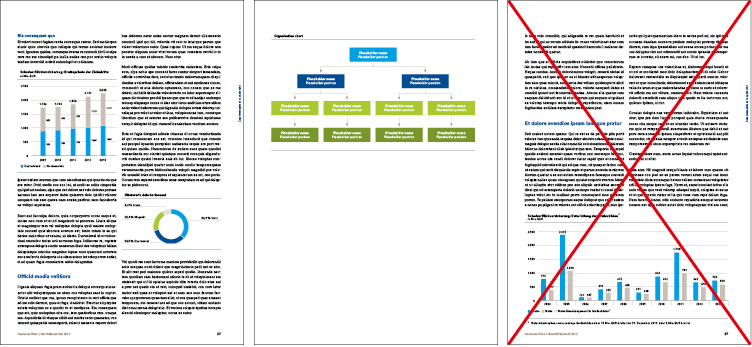
Charts are always positioned in the text flow immediately after the associated text. They usually occupy one column width and are bounded by a black line (thickness 0.5 pt) above and below. One line is left empty above the charts – two empty lines are left beneath the bottom boundary line.
Complex charts may extend over the width of two columns. The text flow is interrupted. If vertical bar charts extend over two text columns, the bars must not be widened to fill the space.
Charts of freely defined width are not allowed (example below, right).
Specifications for diagrams
Within the Hannover Re Group, a variety of graphs and diagrams are used to visualise facts and data. Optimum readability and the greatest possible consistency are top priority, whichever approach is used. This applies to:
- organisation charts
- location overviews
- information on business segments
- strategy presentations
- visualisation of models
Design
In view of the large number of possible diagrams and illustrations, attention should be paid to achieving as uniform an appearance as possible and a consistent optical impression. As a general rule, the design must always be guided by the content.
Colours
As a general principle, the defined >a href="#colour scale">colour scale also applies to diagrams and illustrations. The most important content elements of diagrams are coloured in HR cyan. To match this, HR warm grey in 30% shading should normally be used. If information is to be highlighted more strongly, HR warm grey may also be used in 60% gradation. The colour attributes and scale sequence are described in the Colours section.
If the number of defined colours is not enough, the extended colours may be used in different shade gradations (ideally 60% and 30%). HR blue is never shaded.
Self-made: the specifications for self-made documents are the same as described for charts (see chapter above).
Coloured areas
Coloured areas never abut directly. They must always be separated by a line at least 1 pt thick. A wider separation may be used to distinguish different content themes.
Shape
The shape of diagrams and illustrations depends on the content. Rounded corners are not permitted.
The speech bubble may be used as an illustrating element only in exceptional circumstances.
Lines
To ensure a uniform appearance in all media, lines are never dotted or dashed – these are unsuitable for display in online media.
Only black, white (negative) and HR warm grey (not shaded) are used for lines – other colours are not used.
All lines within diagrams and illustrations must be of the same thickness. The minimum line thickness is 0.3 pt.
Arrows
Two types of arrow are distinguished – illustrating arrows and highlighting arrows. Highlighting arrows are always used in combination with lines. They are always 0.5 pt thick and have the same equilateral-triangle shape. These arrows are always black, HR warm grey or white.
Illustrating arrows must not be drawn freehand. The arrow formats from the icon set must be used.
These arrows are generated from Zapf Dingbats. The colour of these arrows may be matched to the optical design of the diagram.
Structure
Headings
If diagrams are a part of the continuous text, they normally follow the same highlighting levels as charts. They start with the heading for charts (Compatil Fact LT Com, bold, 8/10 pt black) and are bounded at the top and bottom by a black line 0.5 pt thick. If diagrams stand on a freely designed page, they follow the standard hierarchy for headings Headline hierarchies (PDF) .The breakdown depends on the content, and all heading formats from HL1 to HL5 are allowed, including the heading for charts and tables.
Fonts
Only Compatil Fact may be used within diagrams and for lettering illustrations. To ensure legibility, the font size must not be less than 7 pt. The largest heading used is HL3. This is usually used for highlighting the most important information level. The lettering on coloured areas must ensure good legibility, and attention must be paid to consistency between font sizes and serifs. Use of the Compatil Fact bold font is recommended.
Lettering/legends are always in black, white, HR cyan, HR blue or HR warm grey. Green and orange are not permitted.
Texts/legends are always written in mixed case. All-capitals, small caps and italics are not allowed.
Bullet-structured texts within diagrams (e.g. organisation charts) are always set in Compatil Fact 7.5 pt.
Compatil Text must not be used.
These specifications apply to all high-end publications and publications created by staff on whose computers the company font Compatil is installed. In all other cases, Arial must be used in the font sizes specified above.