How to use fonts
Fonts are not mixed. We do not use italics, capitals and/or underlines (exception: text links). We avoid distracting distortions, effects and animations. Especially do not use: shadows, 3D effects, vertical text direction, curves etc.
Logos
The logo fonts Avenir Light Oblique and Avenir Black Oblique are reserved exclusively for the logo and the claim. They may not be used in any other contexts.
For further details refer to the sections Logos and Claims.
Printed materials
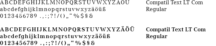
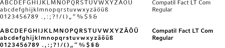
Hannover Re's company typeface is Compatil®. It consists of a "classical" roman type (Compatil® Text) and a "plain" sans serif (Compatil® Fact), both from the same type family. This harmonic combination makes for a lively and yet uniform typeface. Only the original styles may be used for producing printed materials. On no account may the fonts of the same name installed on computers be produced in bold or italics using the functions offered by word-processing programs. This implies that printed publications for external use must always be produced in commission by an agency or typesetter.
- Compatil® Text serif typeface; used for headline text, continuous text and to highlight quotes – the linguistically lively part of the CD.
- Compatil® Fact sans serif typeface; used for advisory text, sub-headlines, illustration captions and cross references and serves for highlighting statements of fact.
Further information regarding the font hierarchies of print product is provided in chapter Font hierarchies.
Compatil® Text
Serif typeface in the fonts:
- 41887 Com Bold
- 41885 Com Regular
Compatil® Fact
Sans serif typeface in the fonts:
- 41879 Com Bold
- 41877 Com Regular
External service providers
External service providers (printers, agencies, etc.) that create documents of Hannover Re (publications, business cards, etc.) have to purchase the licence for Hannover Re's company typeface at Monotype GmbH.
Printers and advertisers working for Hannover Re can buy the Compatil font licence and directly download the font styles on the Linotype download platform:
Applications
For graphic user interfaces (GUI), please refer to the Online Style Guide.
Microsoft Office
Pre-printed business papers use the company typeface Compatil® but are completed by the user in the Arial font.
Certain Word documents, e.g. external newsletters or team sheets, are set in Compatil®. These documents may only be produced by staff on whose computers the company font is installed.
For further details refer to the section on MS Office.
In all other MS Office-applications the Arial font is used. The appearance of Compatil text must on no account be imitated using a pre-installed serif typeface (Times etc.).