Basic principles
The following table gives an overview of the publication types and their respective visual attributes. These correlations must be observed in all cases. If you have any questions about the classification of your publications, please contact Corporate Communications.
Title - Front side
The standard format for printed materials is DIN A4.
The following design elements are used in different ways in the various types of print publications to give them a form appropriate to their content and purpose and to optically distinguish the different types. The elements marked with an * are used only in certain types of publication, the others are mandatory.
Title pages are composed of the following elements:
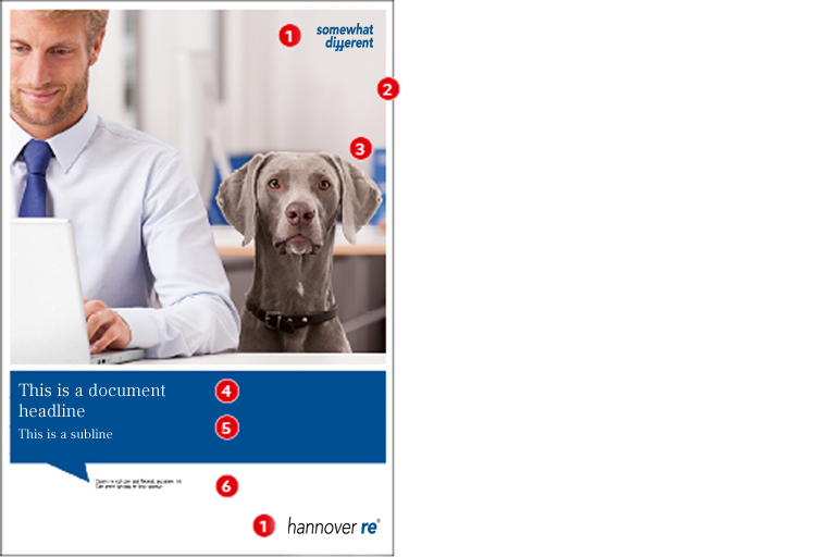
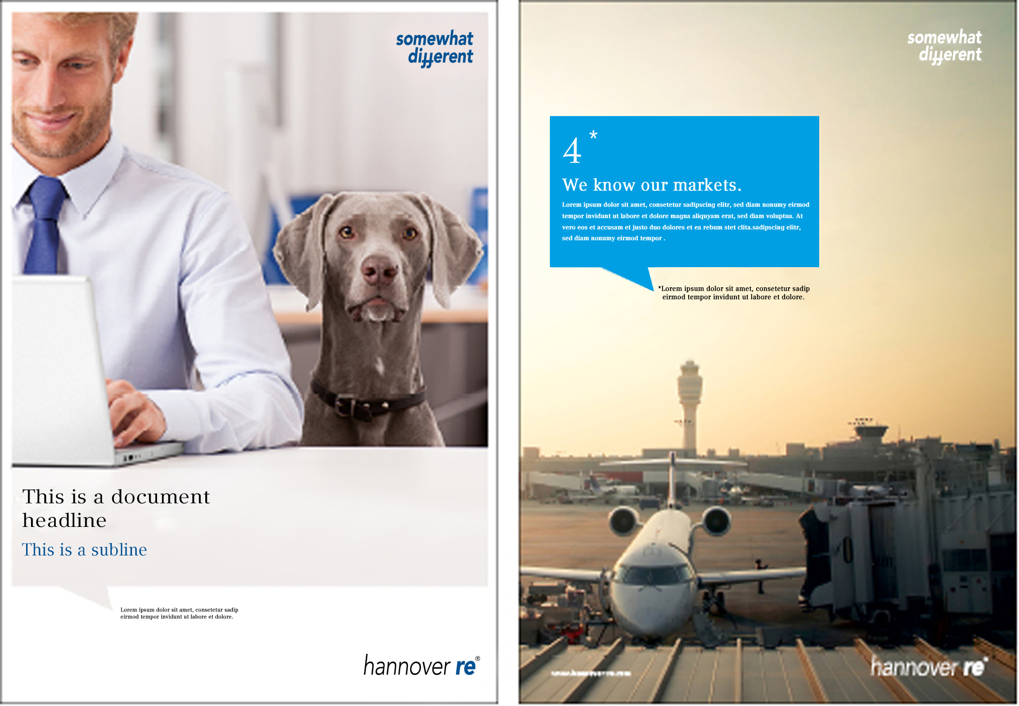
1. Logo/Claim
2. Picture frame
A distinctive design element is the white frame around images and coloured areas. Relative to DIN A4, this frame is 5 mm wide. If a picture fills the entire format (e.g. in advertisements), the 5 mm frame defines the distance between the speech bubble and the border.
A distinctive design element is the white frame around images and coloured areas.
To preserve the weighting of the frame relative to the page format, it is scaled in defined steps relative to the format. The dedicated table defines the width for the DIN format series (PDF). If a non-standard format is used, the nearest DIN format must be used as reference.
The white frame is also used as a design element on inside pages for setting off images and coloured areas. Details are described in the section on Inside page design.
The frame size for exhibition displays and other oversize formats (large areas, strips, etc.) is not defined as a fixed value but in proportion to the format width. The dimensions are described in the dedicated sections Display wall.
The border around images and coloured areas for documents printed by staff on office printers is defined at 3mm to make allowance for the printer margin. The Word templates provided are set up accordingly. Details are described in the section Inlays - self-made.
3. Image motive
Narrative photos should be used in composing illustrated title pages for publications. Please observe the information on images and the associated captions under Images.
4. Coloured area
Depending on the publication, the primary colour HR blue and the secondary colours HR cyan and HR warm grey are available for use (HR warm grey may optionally be used in 30% raster gradations). Recommendation: Group publications preferably use HR blue, but image brochures preferably use HR cyan. The table on the publications system identifies the colours to be used in each publication type.
5. Speech bubble
The speech bubble element visualises the notion of "talking pictures." It is constructed according to strict rules and is used in the layout in three ways:
- as a picture frame: the speech bubble is filled with an image
- as a coloured area: the speech bubble accompanies the image or, depending on the type of publication, stands alone on the title page
- as a border or line without any image
The speech bubble element must not be imitated freehand. Details are described in the section on Speech bubble.
6. Picture captions
The Hannover Re-Group's imagery scheme works with narrative photos (Image concept). To reinforce the narrative character of the images, each picture is given a caption which provides supplementary information on the image or on the content of the publication.
Use of picture captions is clearly defined in the Corporate Design:
Title page
Pictures on the title page are also given a caption irrespective of whether the picture is in the form of a speech bubble or a rectangle with a speech bubble as a coloured area (see Speech bubble).
Length: the picture caption on a title page should ideally be set in two lines and not have more than 130 characters.
"No goes": the caption must not include e.g. information on the author of the publication, the version number nor any information that does not relate directly to the picture or the content.
If a title page consists only of a coloured speech bubble (whether as a shaded area or an outline), the caption is omitted.
Inside pages
Images used on the inside pages of a publication also get a caption.
Font hierarchies
Print products follow a defined font hierarchy which must always be strictly observed. The applies both to title pages and inside pages.
Title - Reverse side
For each type of title a corresponding design for the reverse side is available. You can find it in the respective PDF file.
Parts of the title
The elements are briefly described below. More detailed information is given in the Basics section.